Introduction
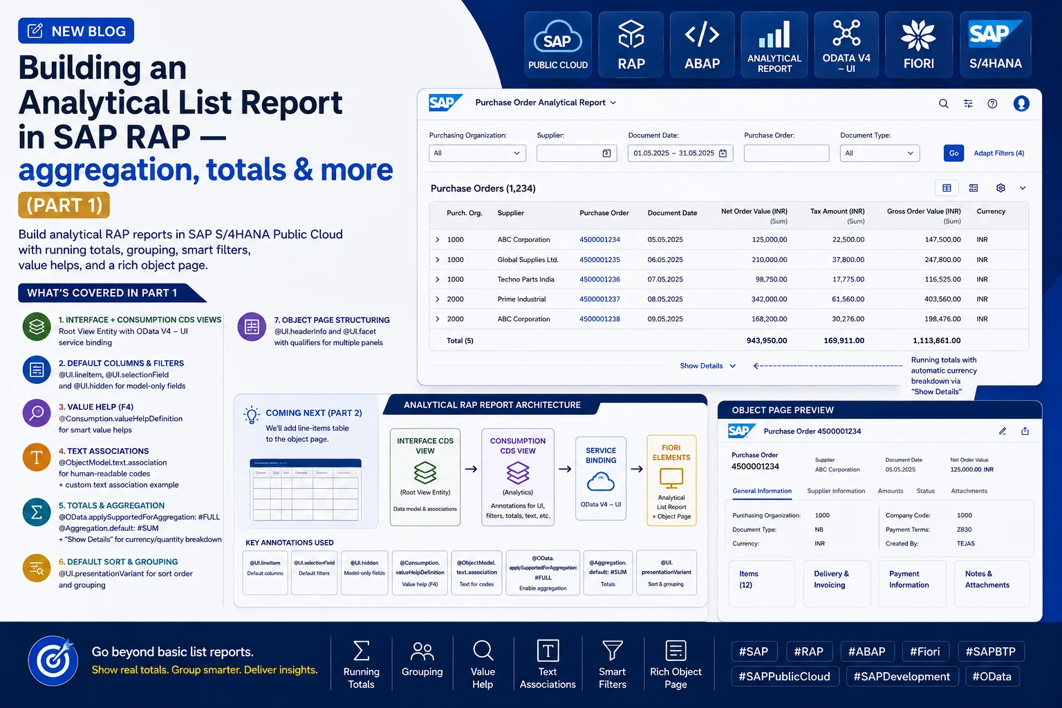
In this post, we'll build an analytical RAP report — a report that includes aggregation, giving us running totals at the bottom of the list. This is a common client requirement: showing totals for amount fields directly in the list report, rather than requiring users to calculate them manually.
Step 1: Create the Package
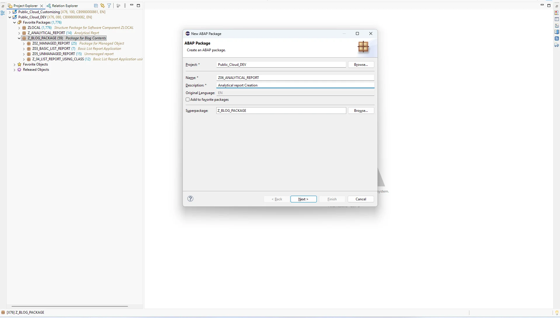
As always, we'll start by creating a new ABAP package (you can reuse an existing one if you prefer).
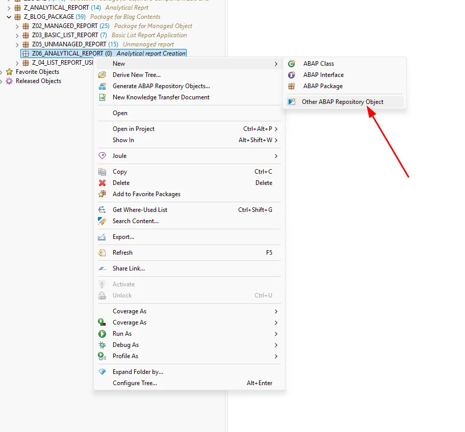
As in my previous post, we'll begin with a new data definition for our interface view.
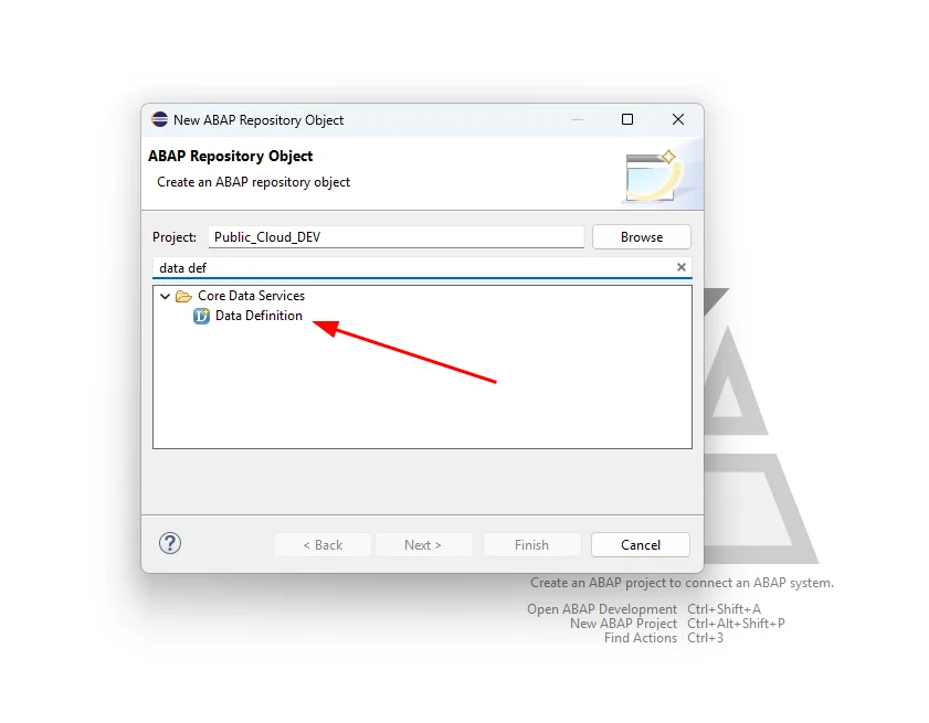
Search for Data Definition.
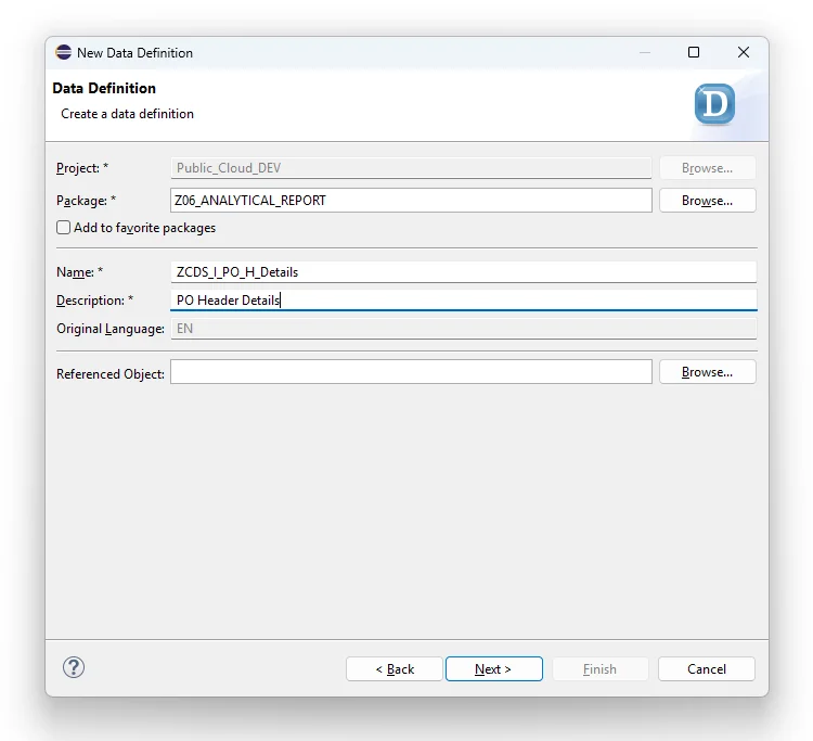
Enter a name and description.
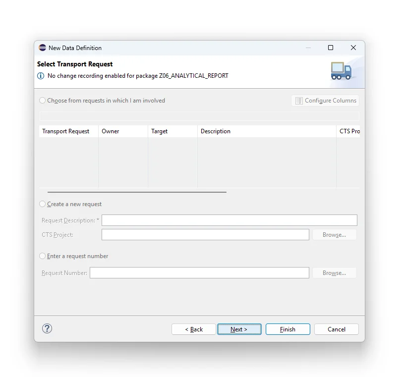
Select your transport request.
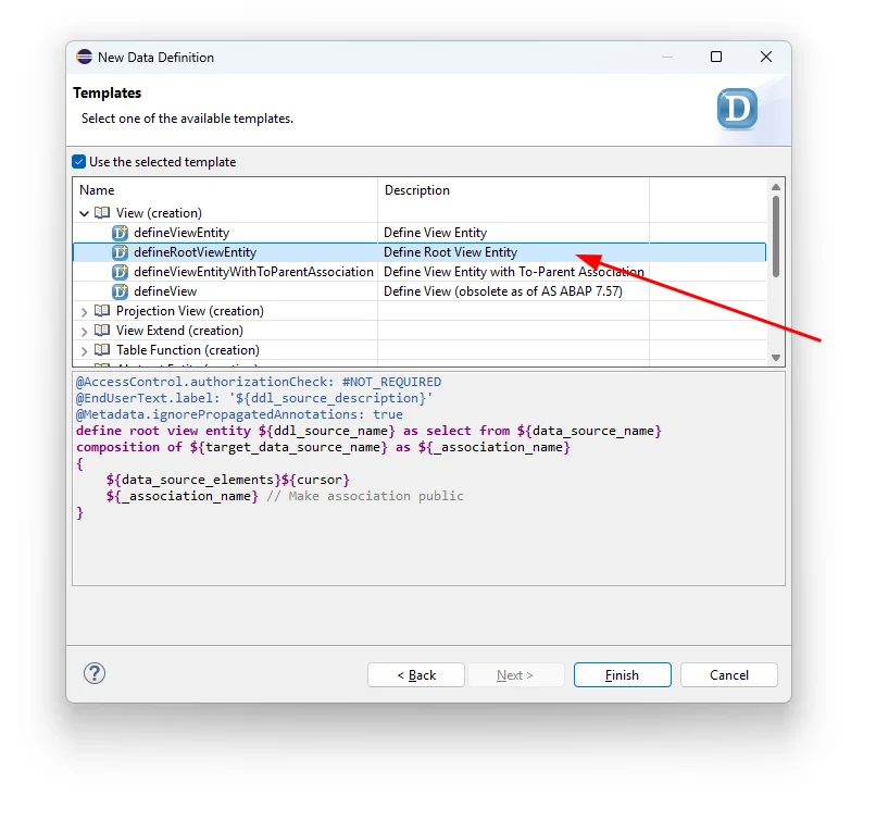
Click Next and select Root View Entity.
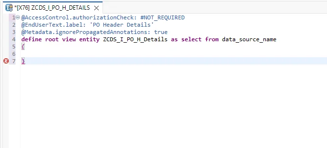
This generates boilerplate code for us to work from.
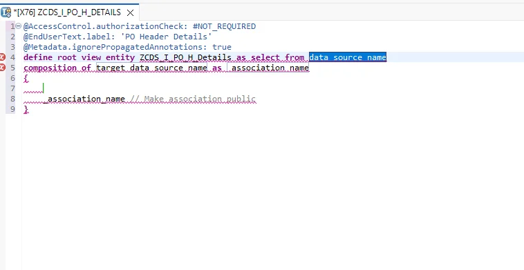
Remove the parts we don't need.
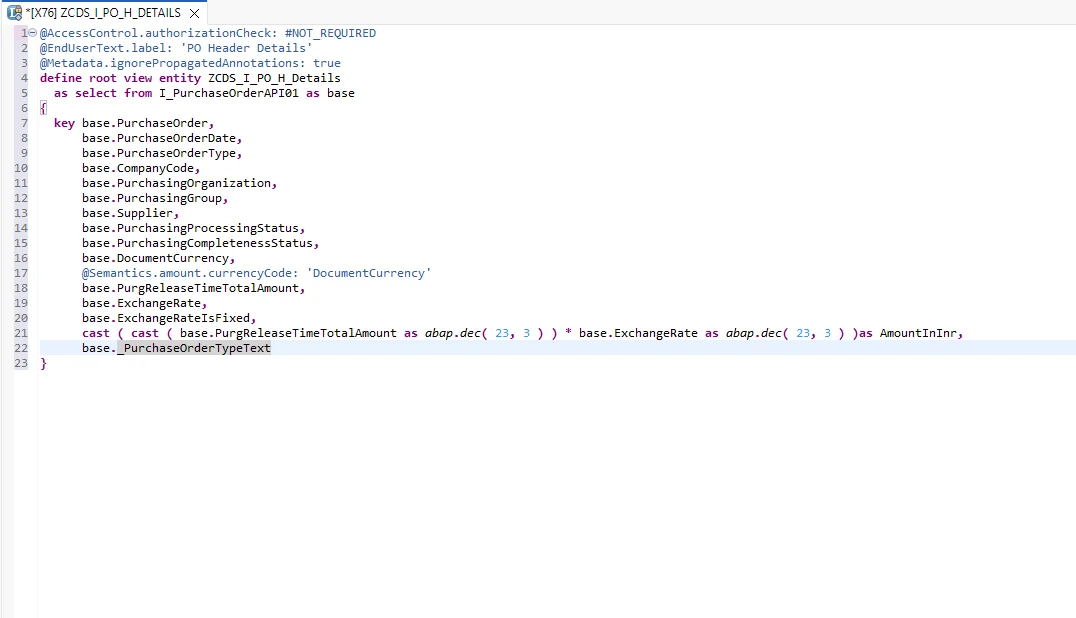
Add the required fields and activate the CDS view.
Step 2: Create the Consumption View
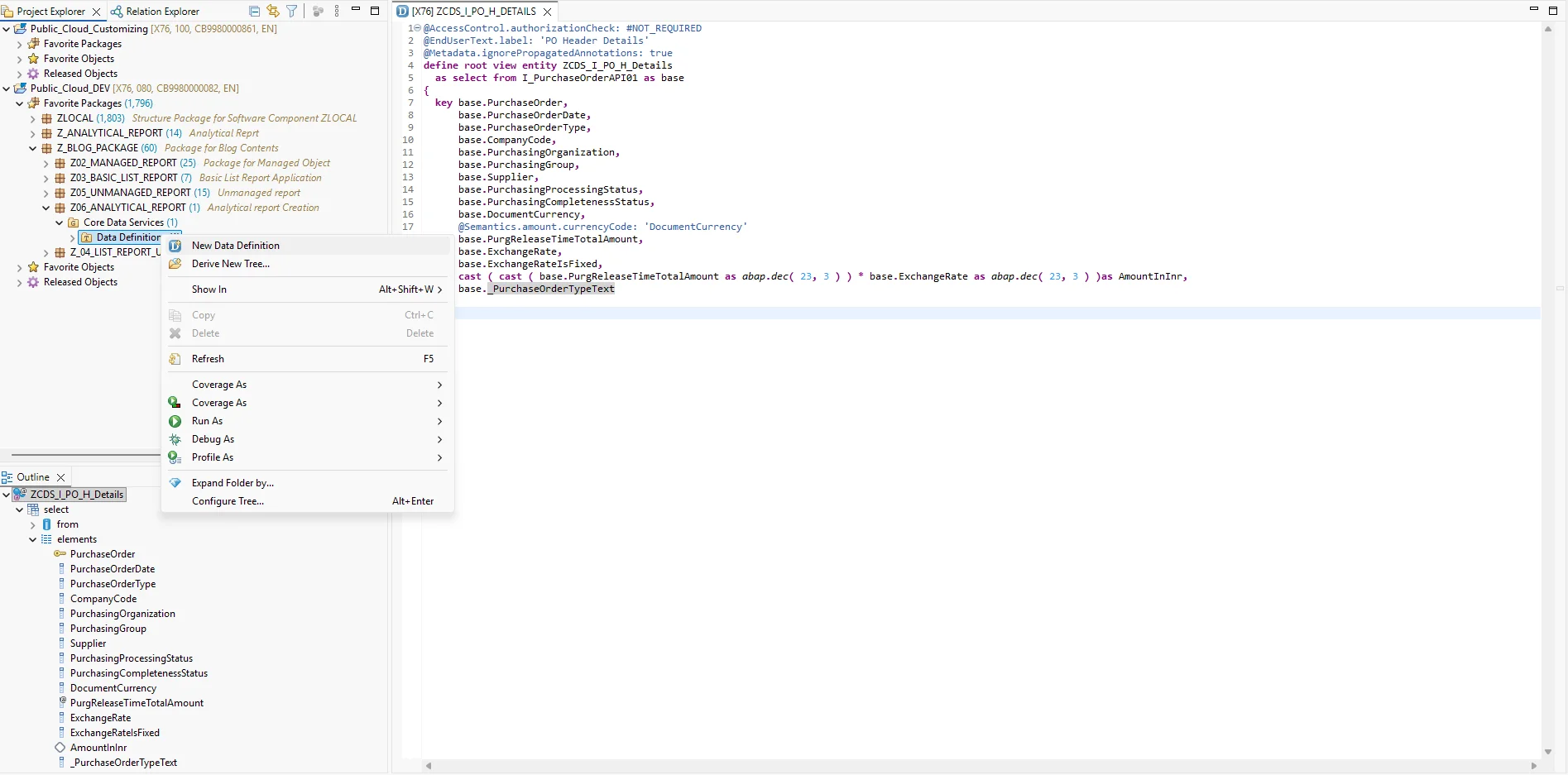
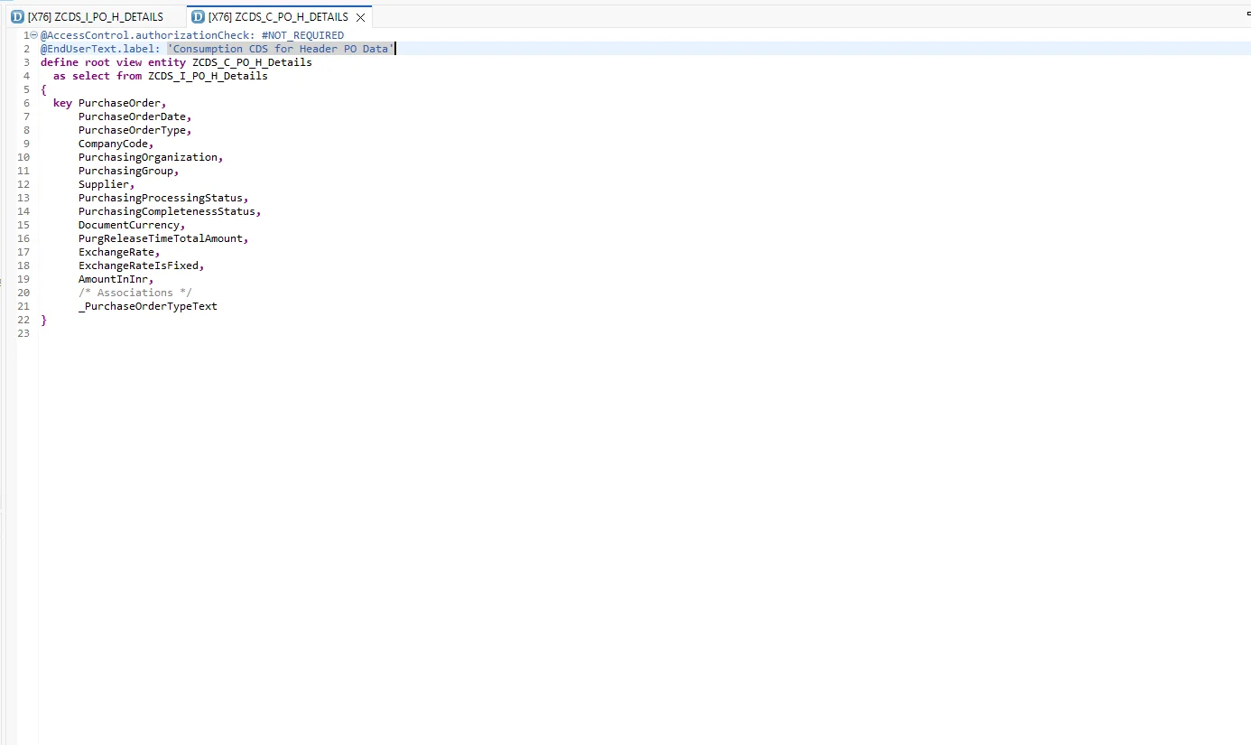
Next, create the consumption view.
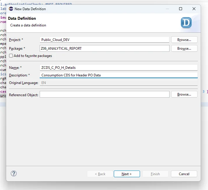
Fill in the details.
Add all the required elements.
Step 3: Create a Service Definition and Preview the App
To preview our work so far, let's quickly create a service definition.
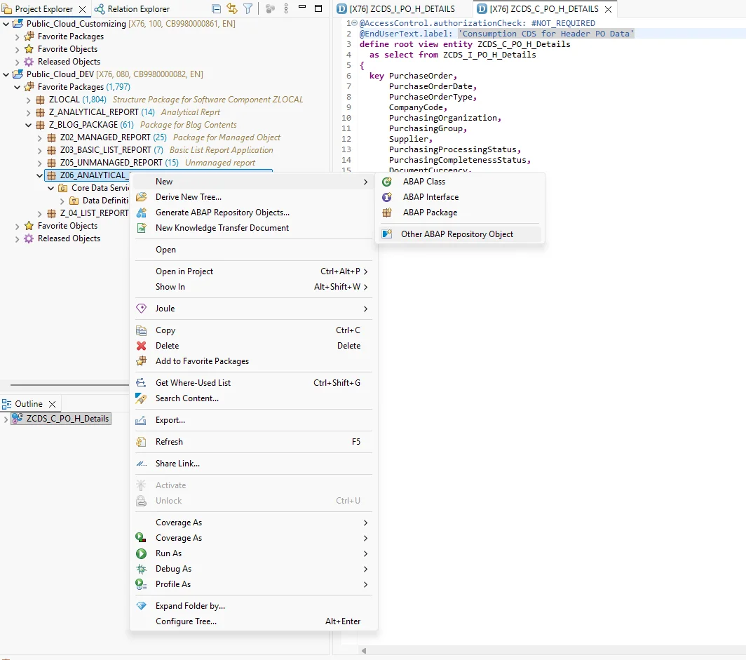
Select Service Definition.
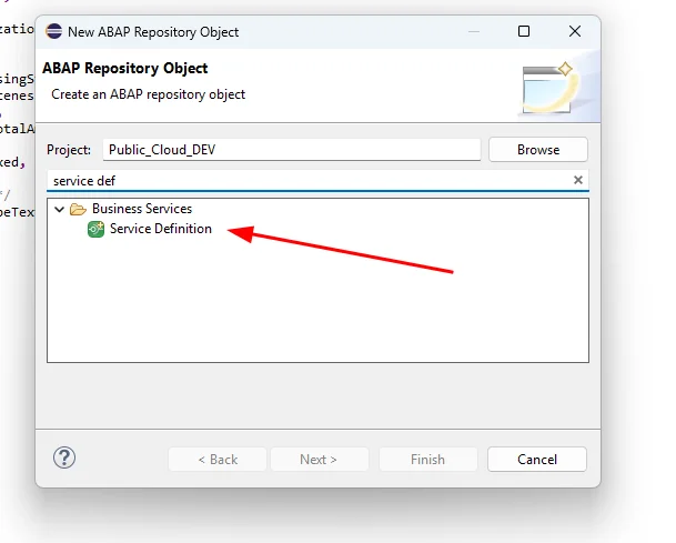
Fill in the details.
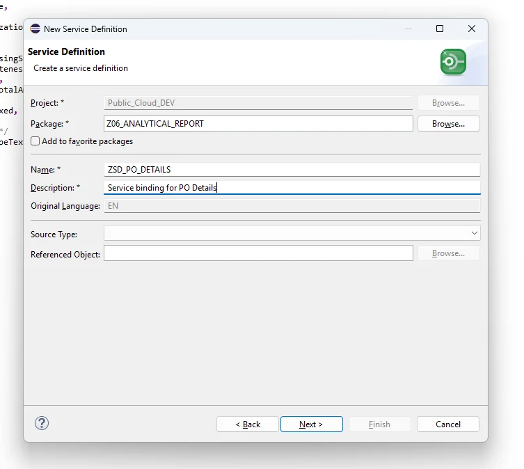
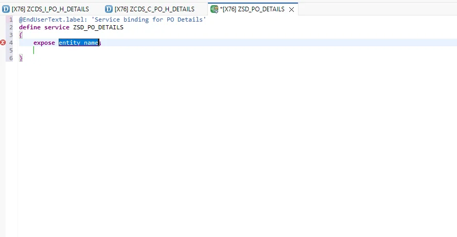
This gives us boilerplate code to start from.
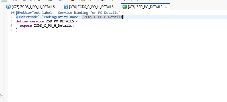
Add our CDS view and set it as the leading entity. The leading entity matters when multiple CDS views are exposed through the same service definition — it defines which one acts as the default.
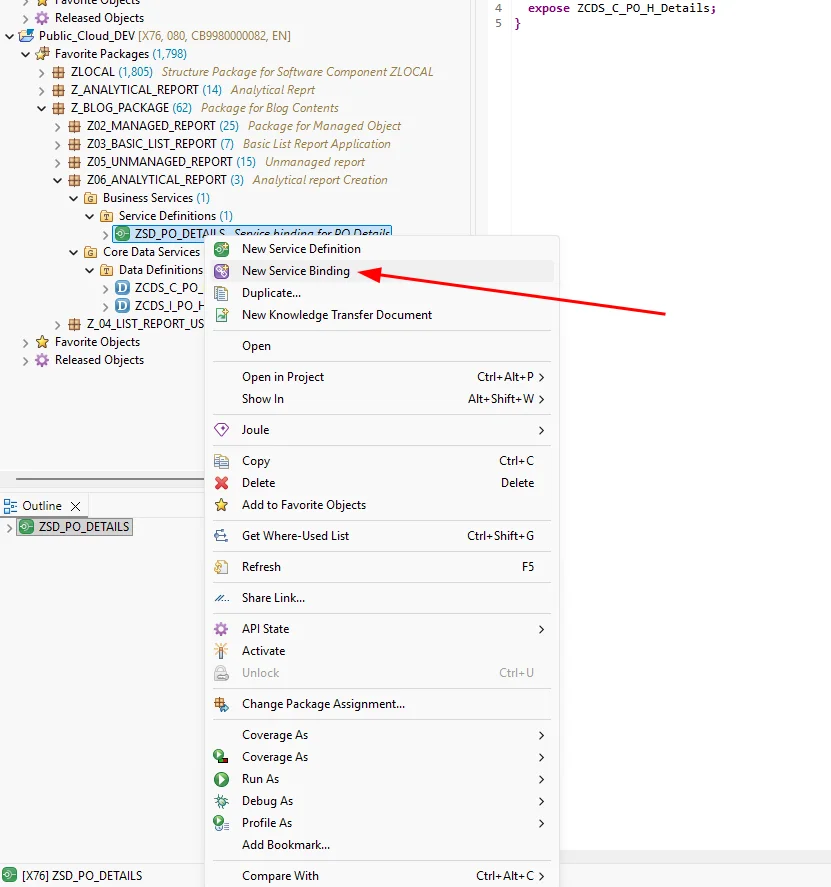
Right-click the service definition and create a service binding.
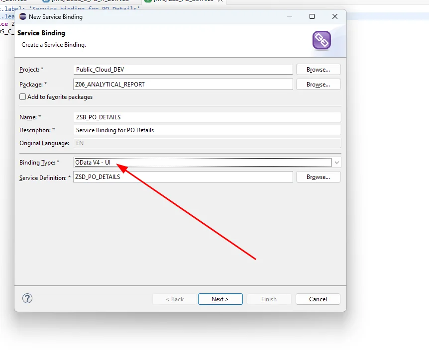
We'll select OData V4 – UI, since we're building a UI application. OData V2 – UI is also available, but V4 is the newer, more feature-complete, and better-optimized option, so it's the recommended choice.
After creation, the Publish button will be greyed out — this is because the service binding hasn't been activated yet.
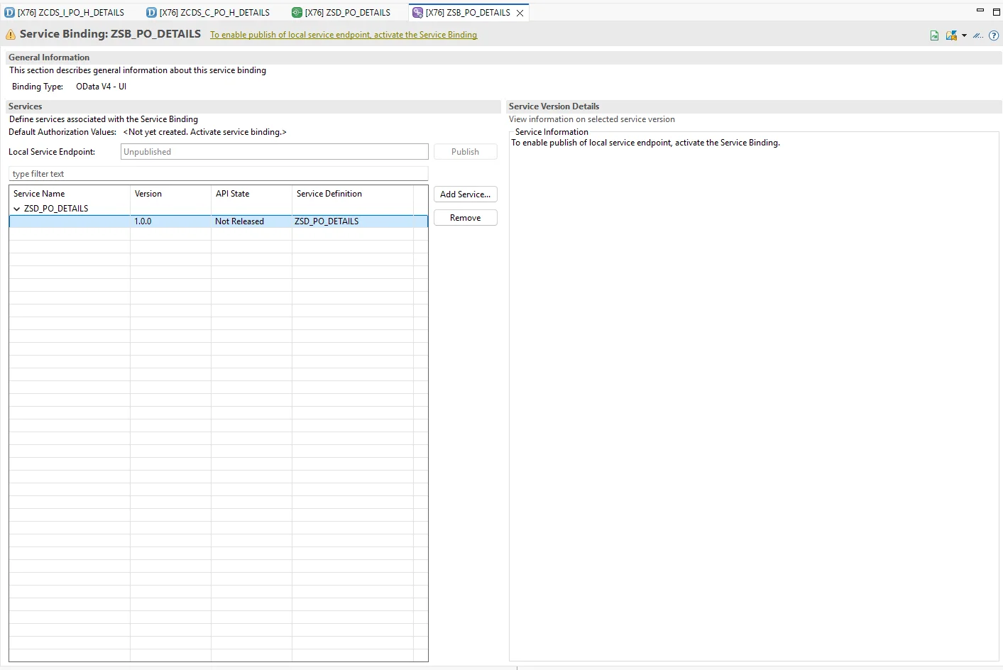
Activate the service binding and click Publish.
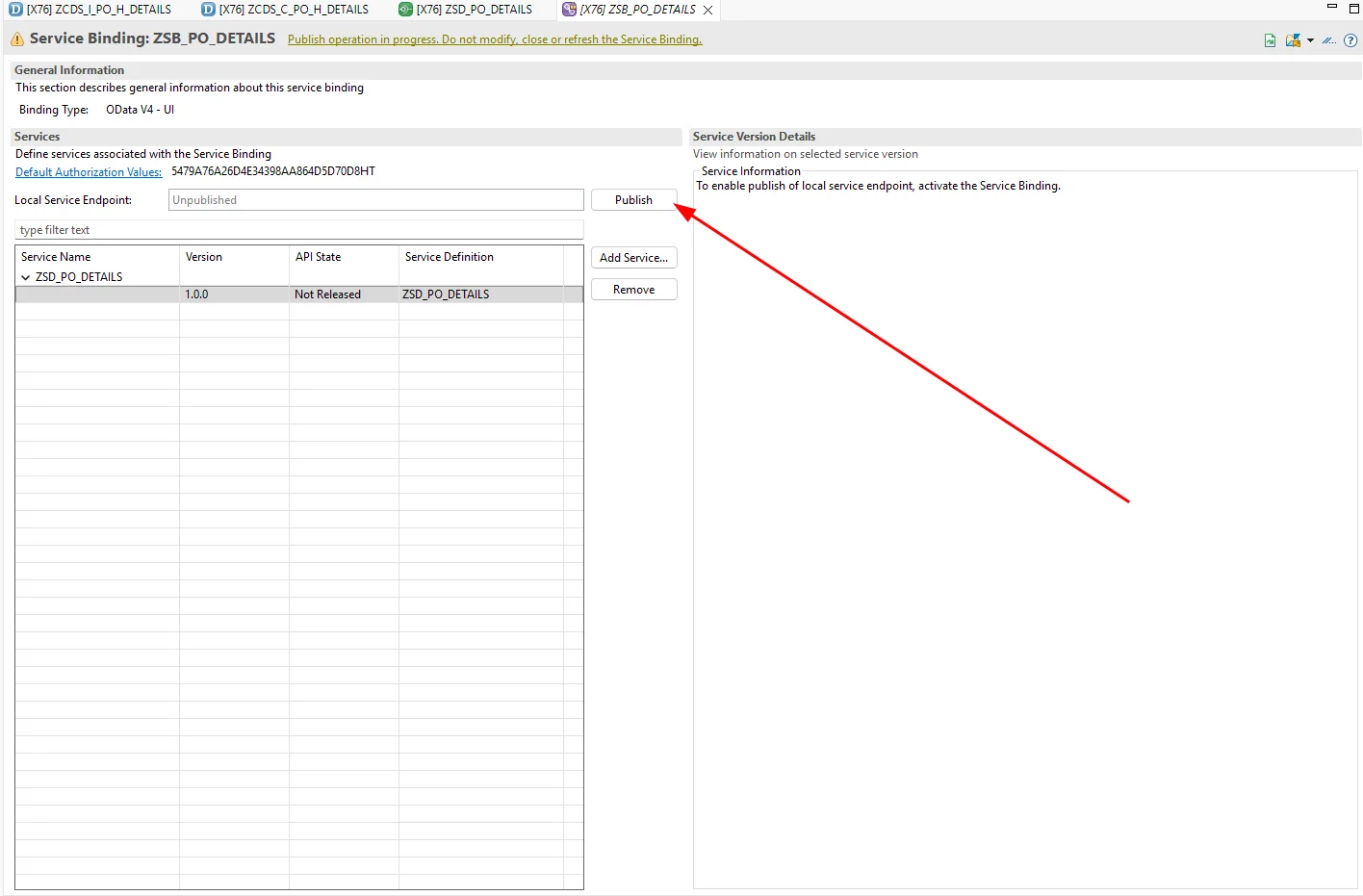
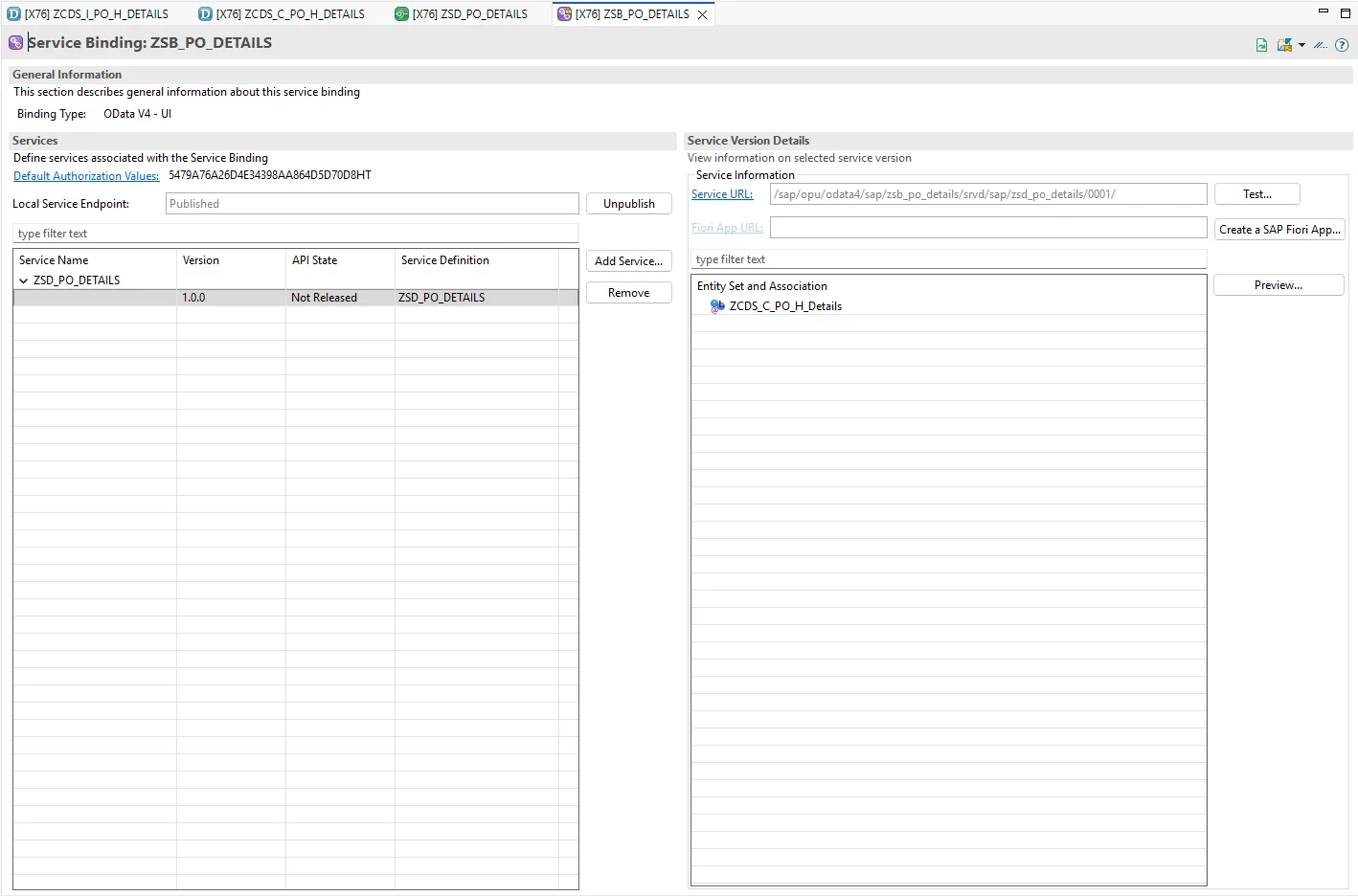
Once publishing completes, select the entity set and click Preview.
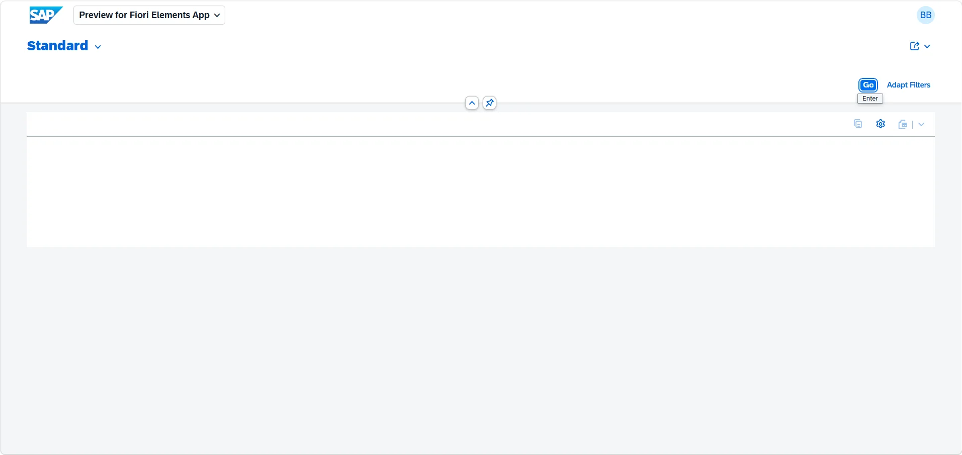
Here's what the report looks like initially, before any annotations are applied.
Step 4: Add Metadata Annotations
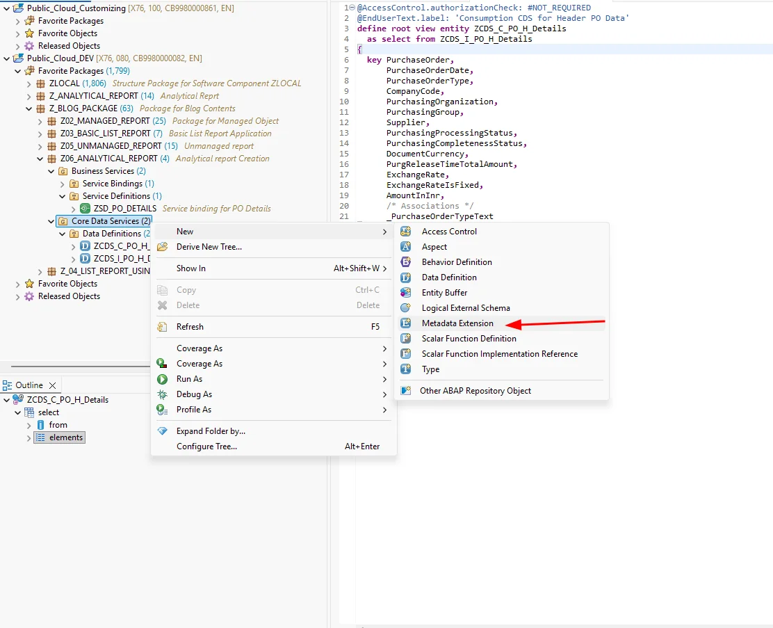
Right-click Core Data Services and select Metadata Extension.
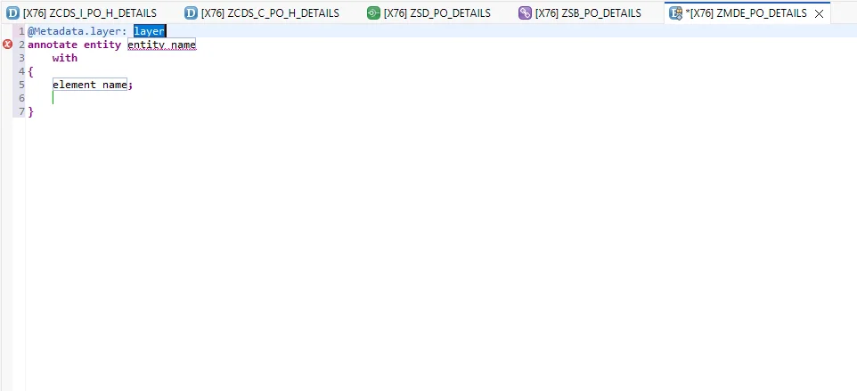
This gives us the boilerplate for the metadata extension.
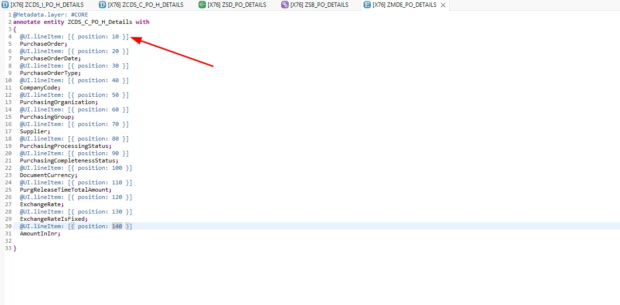
Set @Metadata.layer: #CORE — there are other layer options, but we'll use CORE for this example. Add the elements and annotate at least one of them, since a metadata extension requires a minimum of one annotation. We'll use @UI.lineItem: [{ position: 10 }], which sets the default columns shown in the list. Once added and activated, refresh the preview.
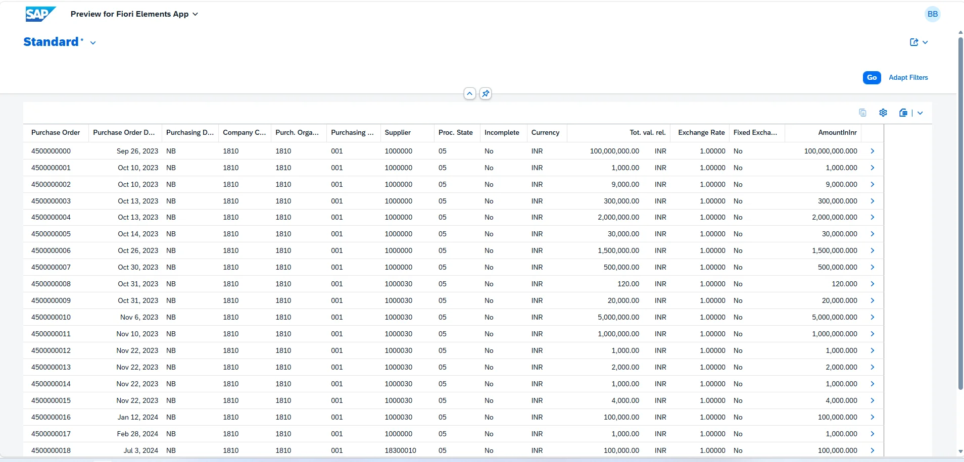
Now the columns are configured by default, so users no longer need to add them manually on every load.
To include a field in the model without displaying it, use @UI.hidden: true.
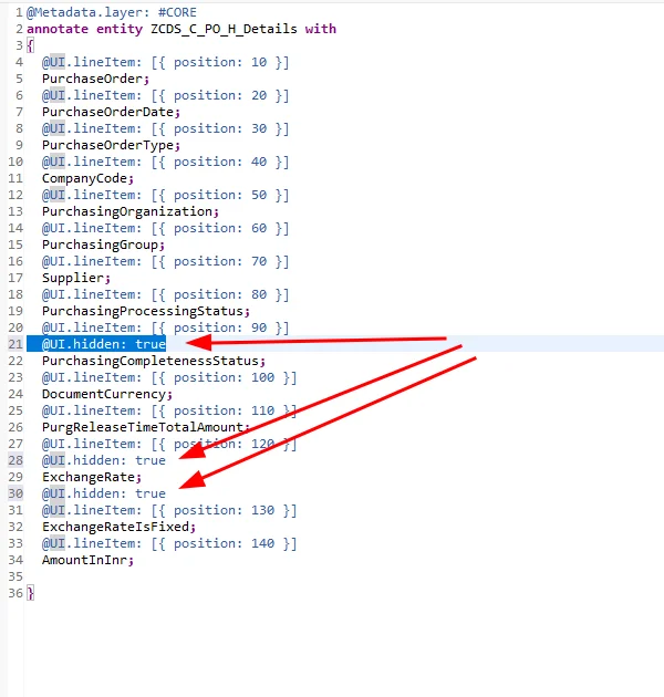
The hidden columns are no longer visible.
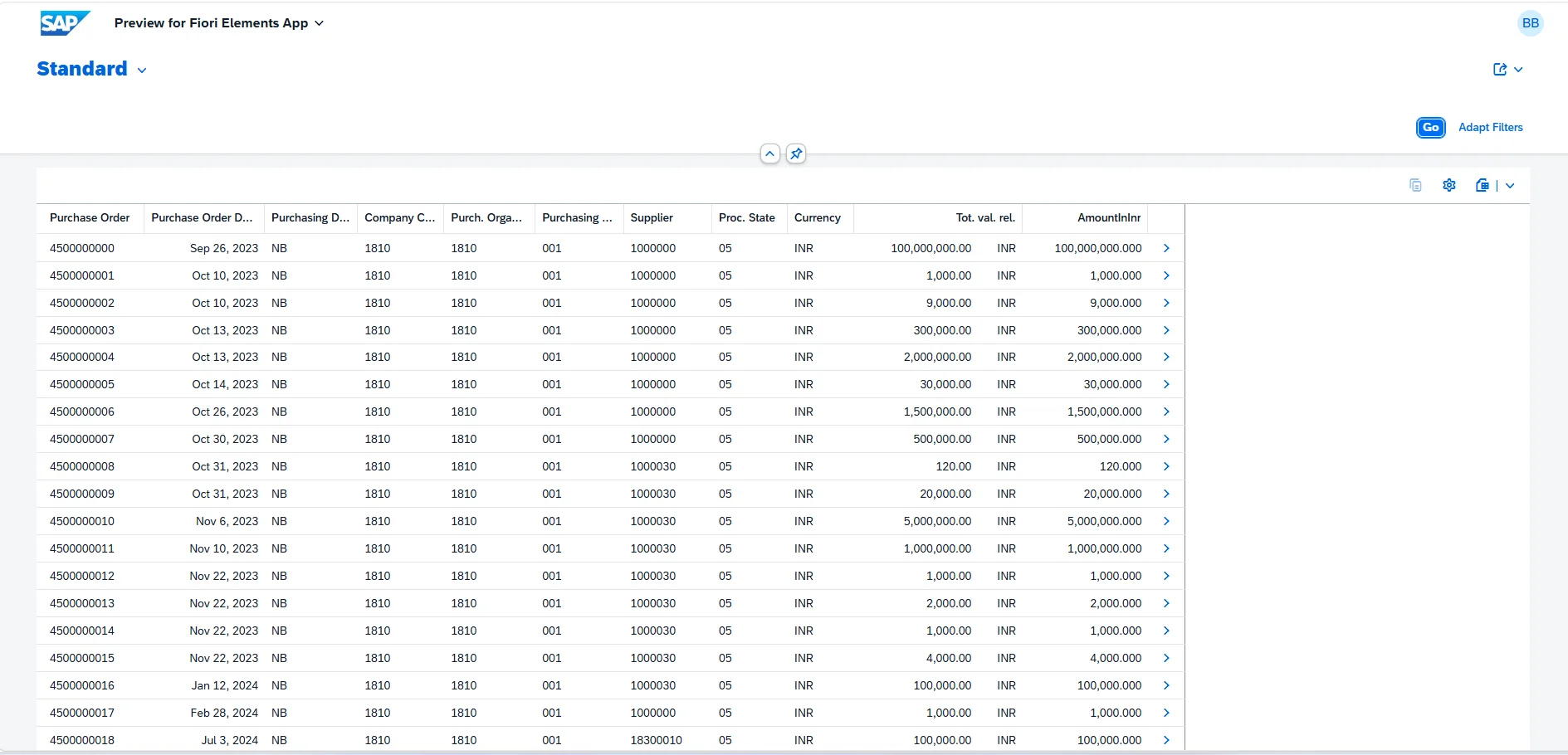
Step 5: Add Default Search Fields and Value Help
Add default search fields using @UI.selectionField: [{ position: 10 }].
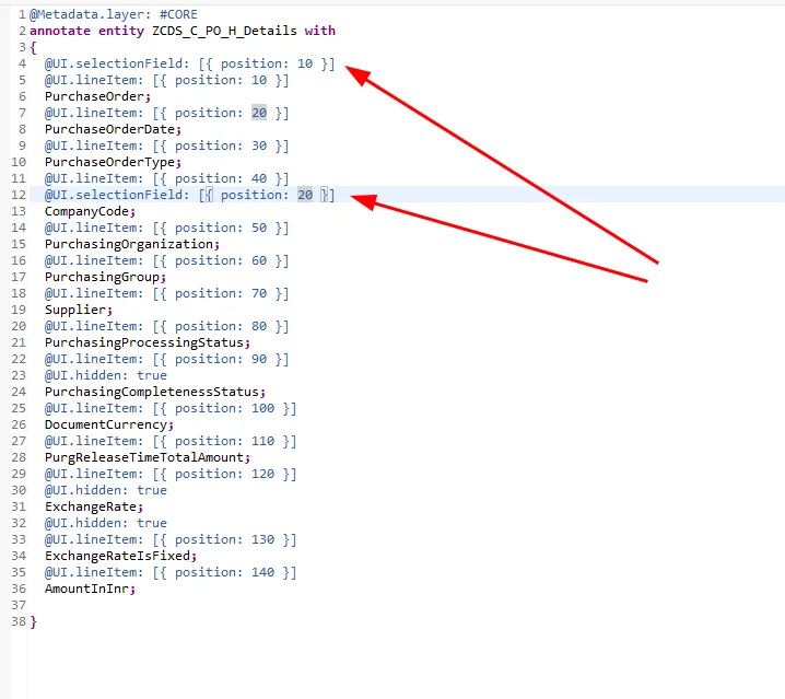
These fields are now available in the filter bar by default, with no need to manually adapt the filters.
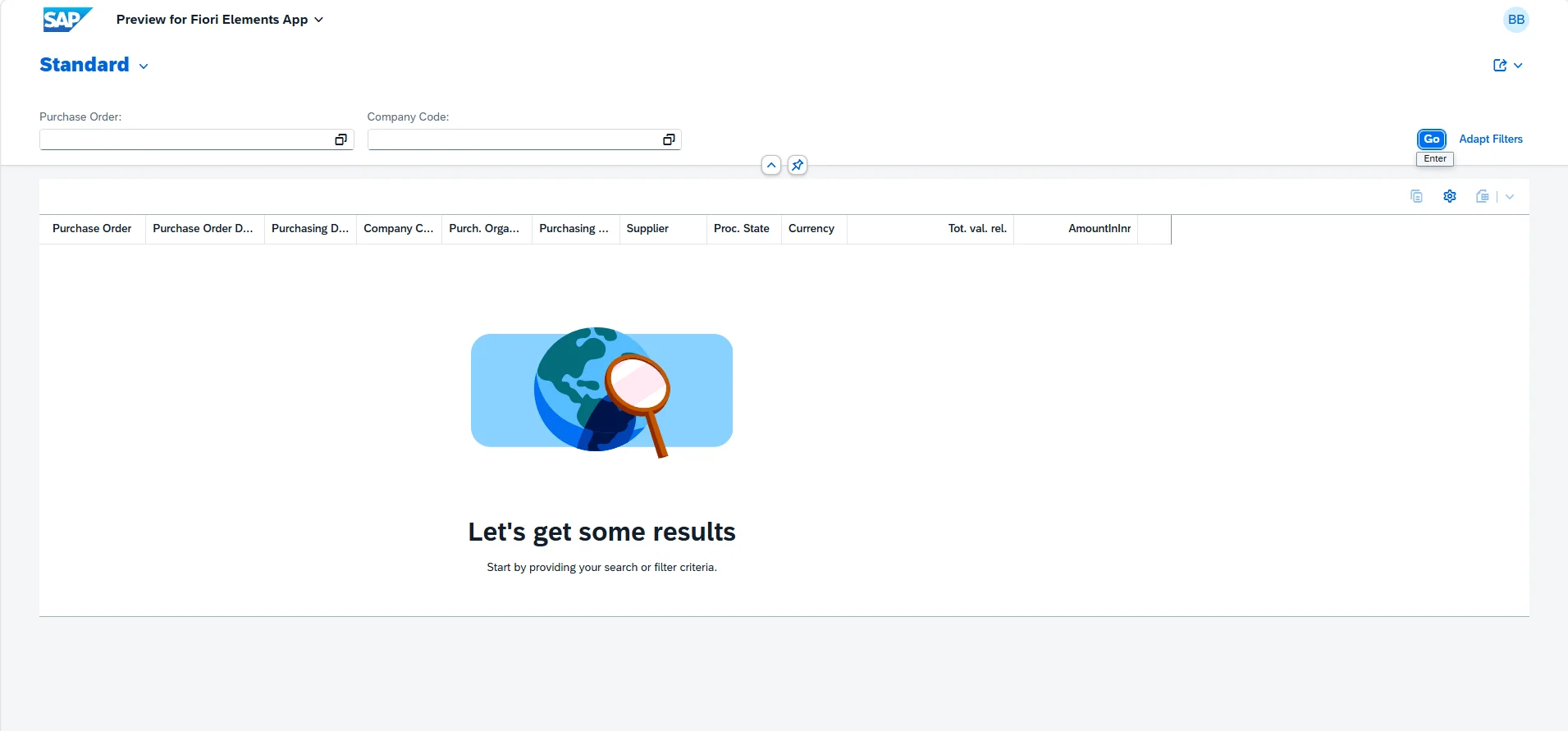
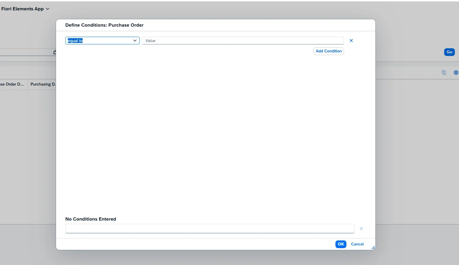
Basic search now works, but users typically won't remember exact values, so let's add value help (F4 search help).
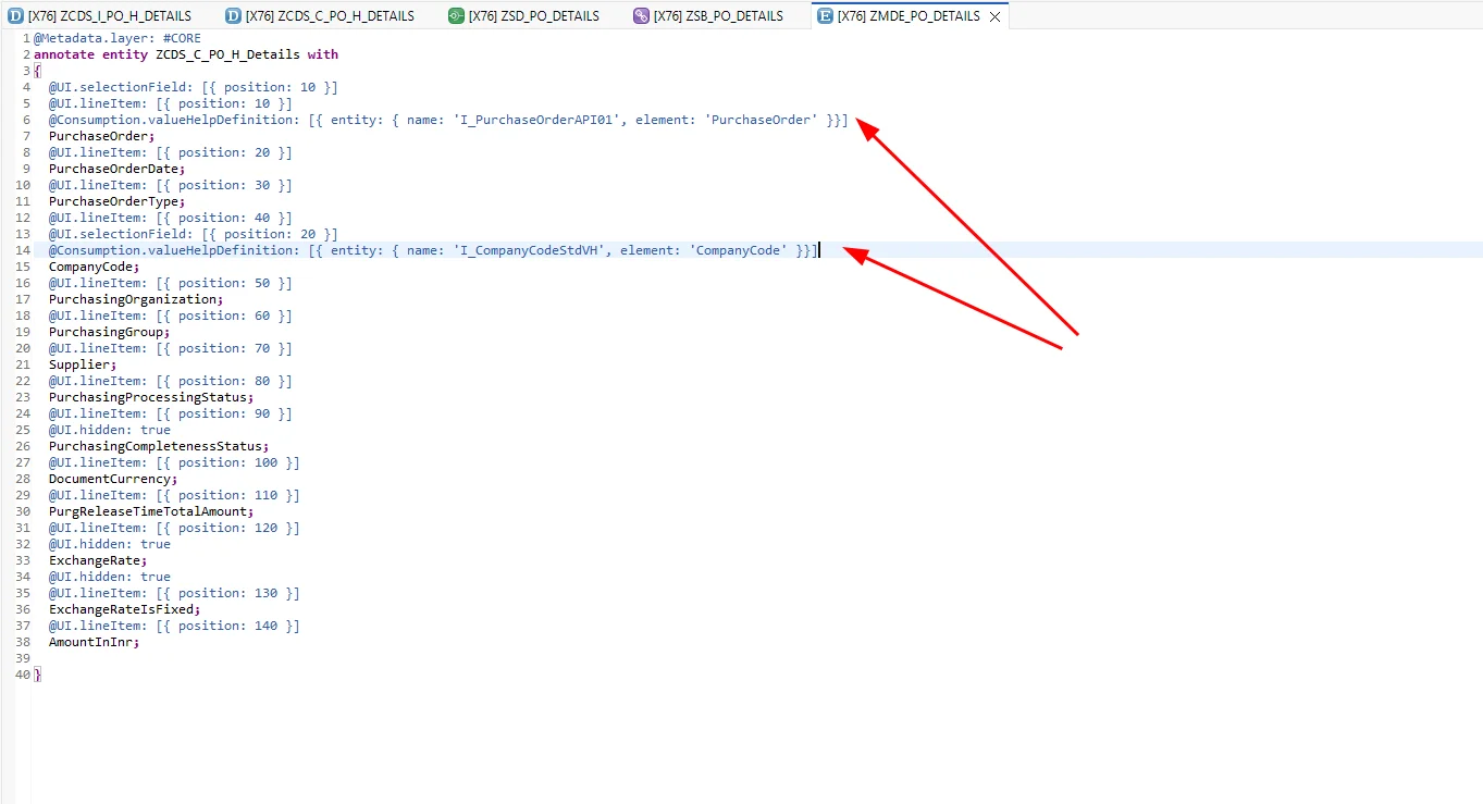
Value help is added using @Consumption.valueHelpDefinition: [{ entity: { name: 'I_PurchaseOrderAPI01', element: 'PurchaseOrder' }}].
Here, name refers to the CDS view providing the values — I_PurchaseOrderAPI01 in this case — and element is the field to search on, which is PurchaseOrder.
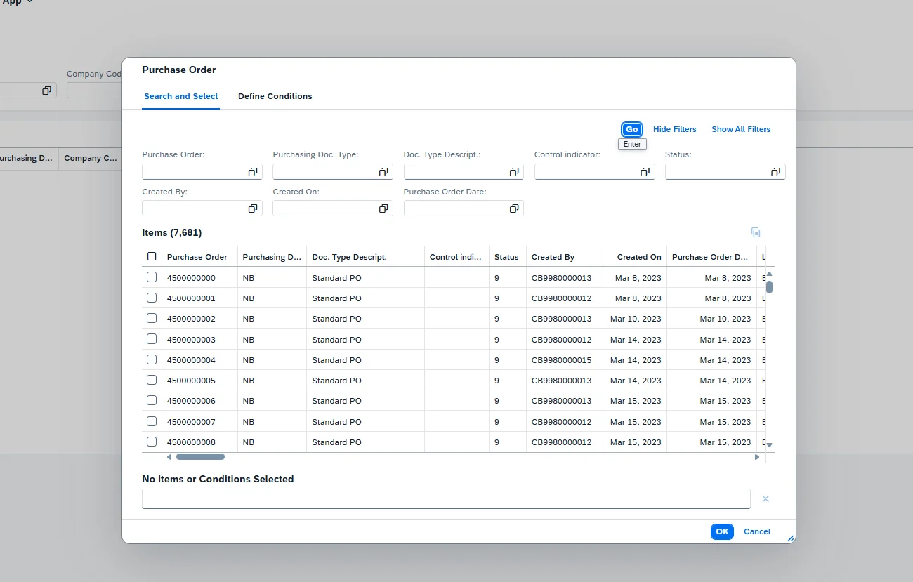
We now have value help for the Purchase Order field.
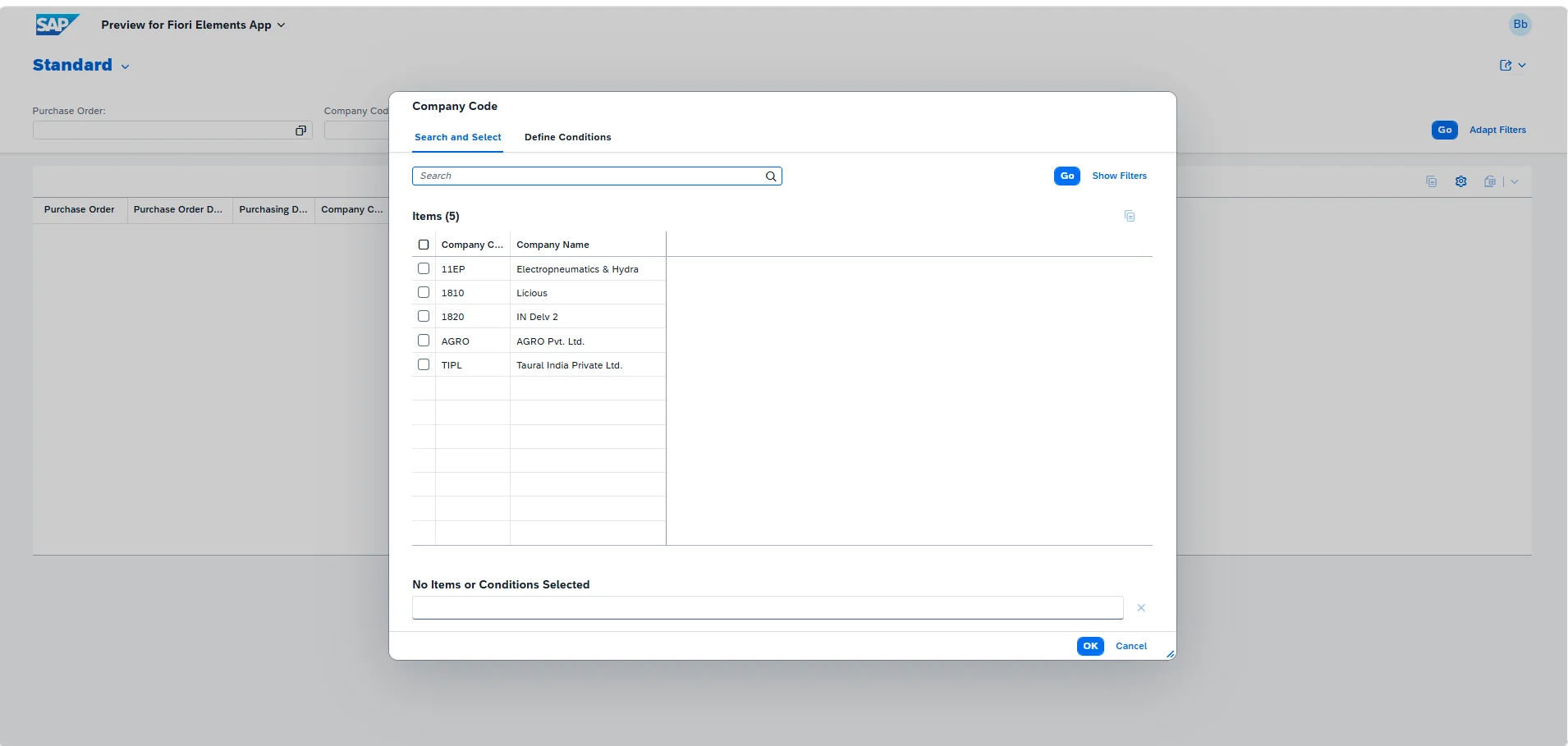
The same approach applies to the company code field.
Step 6: Make Fields Human-Readable
The report is functional, but let's improve readability. Fields like PurchaseOrderType and PurchasingProcessingStatus are stored as codes in the database, and since we're displaying them directly, they currently show as raw numbers rather than meaningful text.
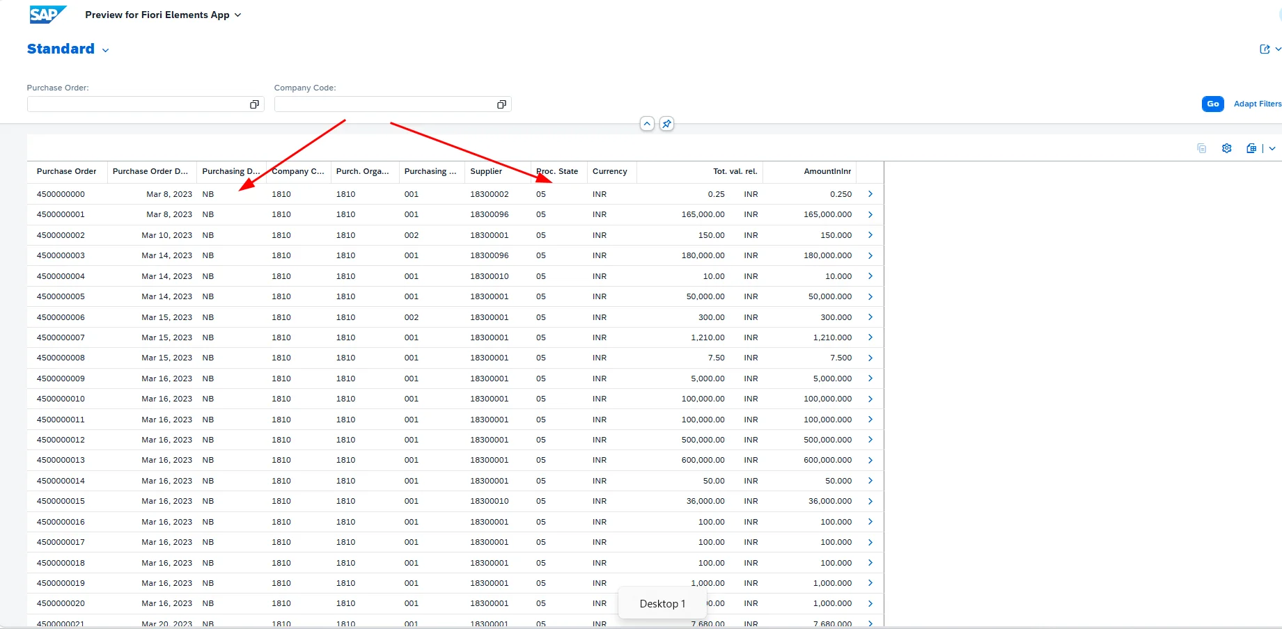
To show descriptive text instead of the code, we add a text association to the field. This is done with @ObjectModel.text.association: '_PurchaseOrderTypeText' in the consumption view.
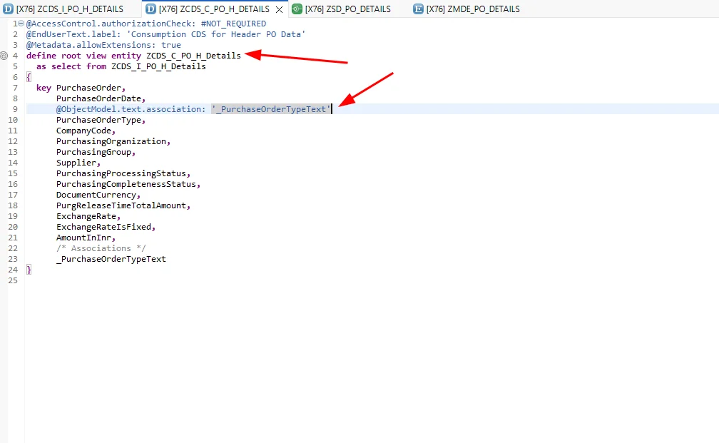
_PurchaseOrderTypeText is already available directly on I_PurchaseOrderAPI01, but that isn't always the case. For PurchasingProcessingStatus, for example, the association isn't available out of the box, so we add it ourselves in the interface view and expose it to the consumption view.
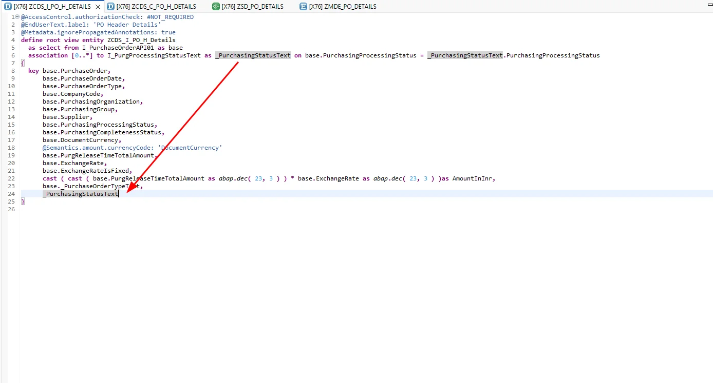
We then reference it the same way in the consumption view.
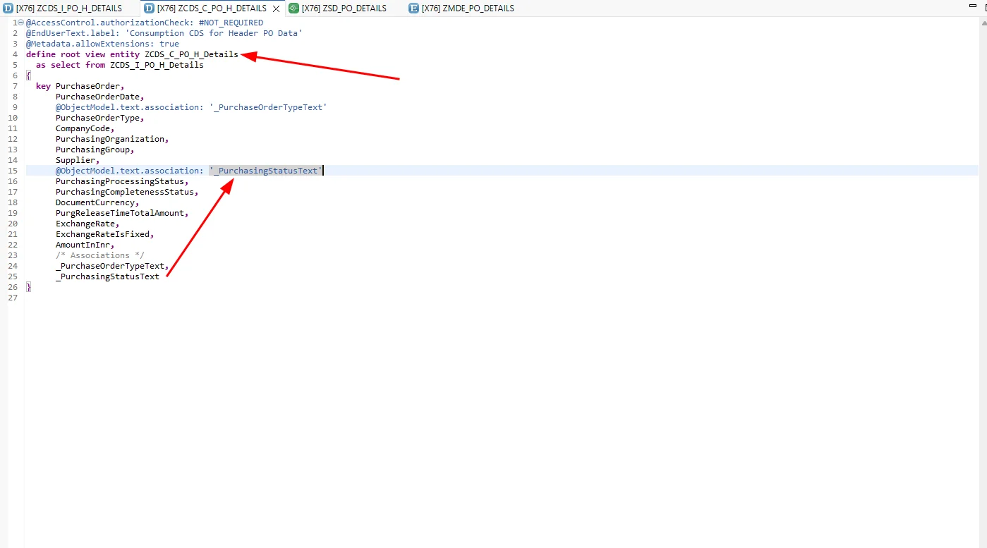
The report is now considerably more readable.
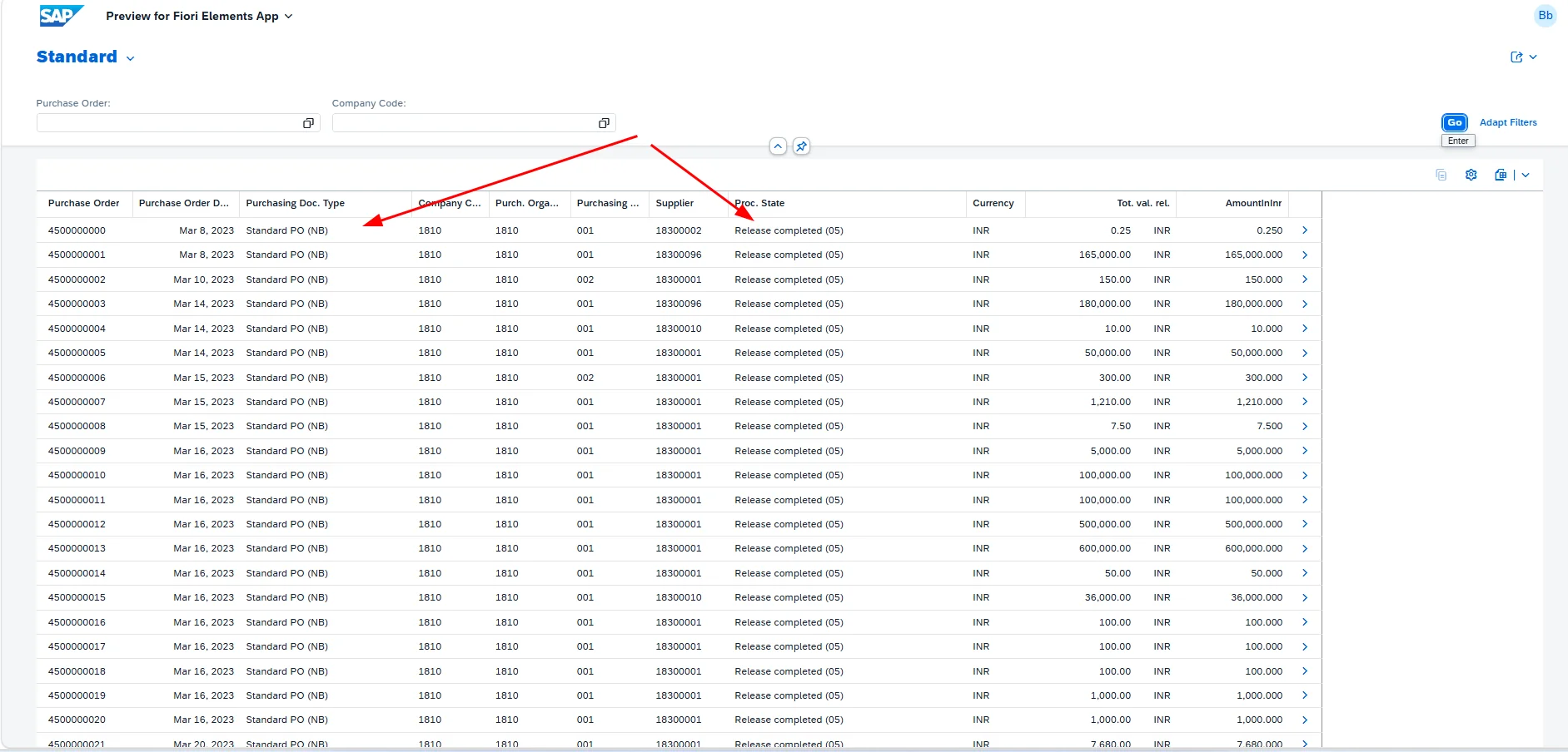
Step 7: Add Totals and Aggregation
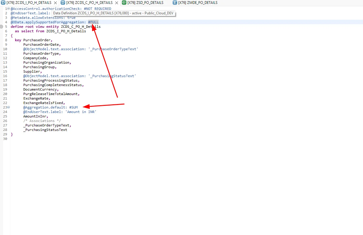
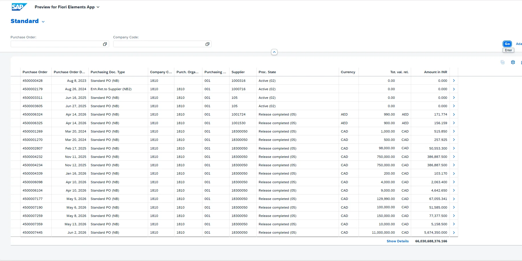
Now for totals. First, enable aggregation support at the CDS view level with @OData.applySupportedForAggregation: #FULL. Then apply aggregation to the specific field — in our case, AmountInInr — using @Aggregation.default: #SUM to sum the column.
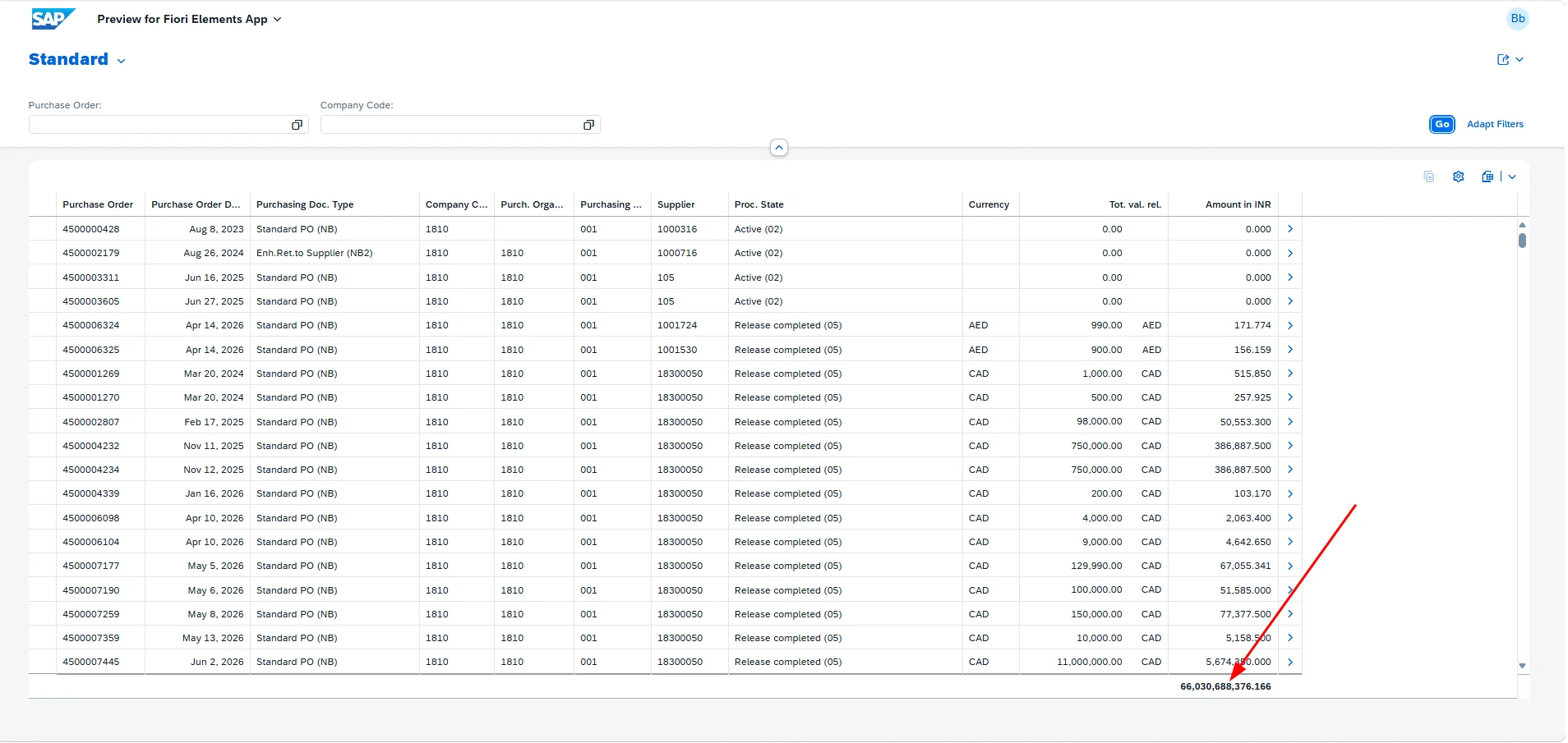
A total is now displayed for the field.
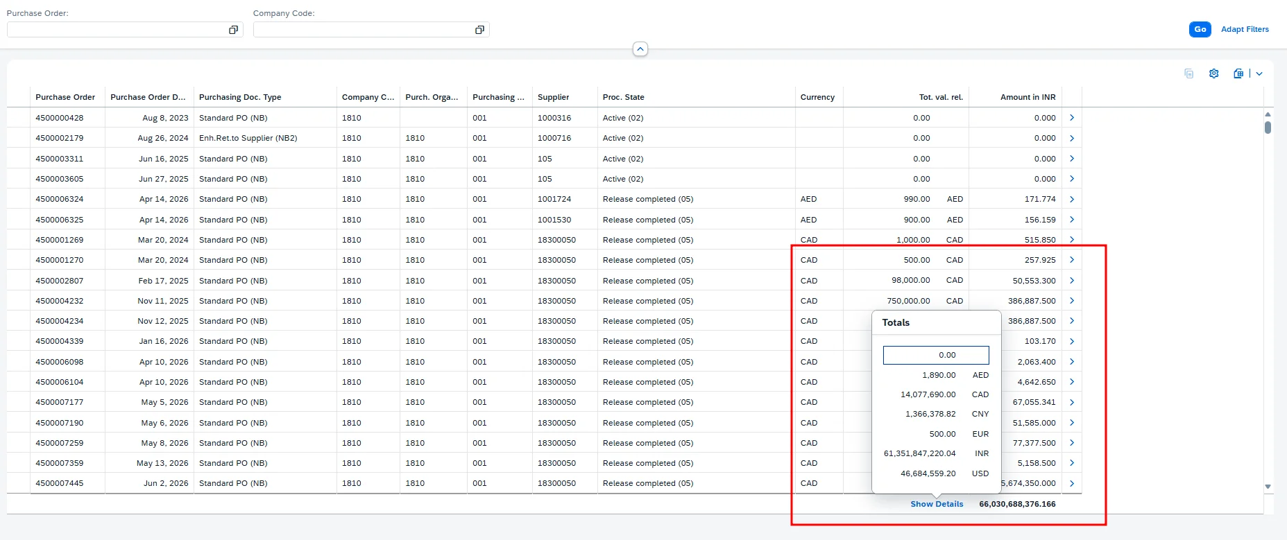
When @Aggregation.default: #SUM is applied to a currency field, a Show Details option becomes available.
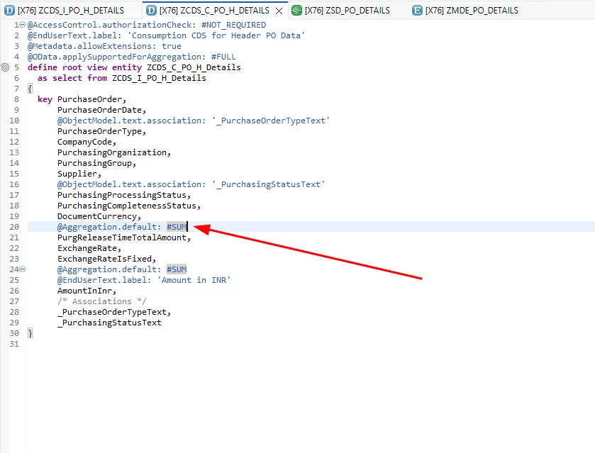
Clicking Show Details displays subtotals broken down by currency.
The same behavior applies to quantity fields.
Step 8: Set the Default Sort Order
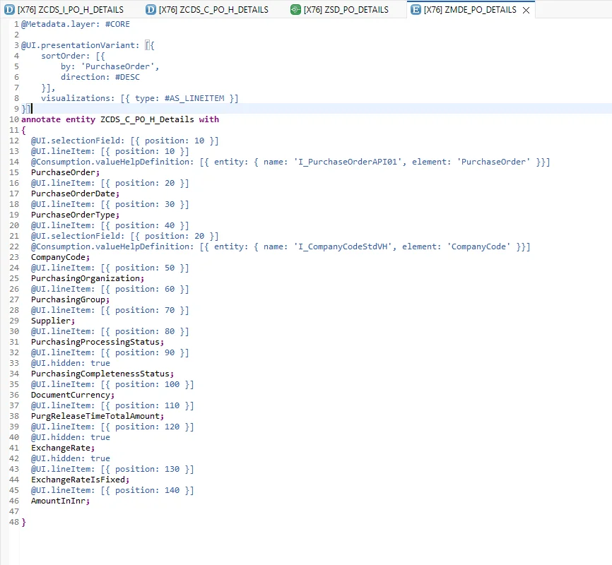
Clients often want the most recent entries shown first (or the oldest at the top). To control this, use a presentation variant:
@UI.presentationVariant: [{
    sortOrder: [{
        by: 'PurchaseOrder',
        direction: #DESC
    }],
    visualizations: [{ type: #AS_LINEITEM }]
}]
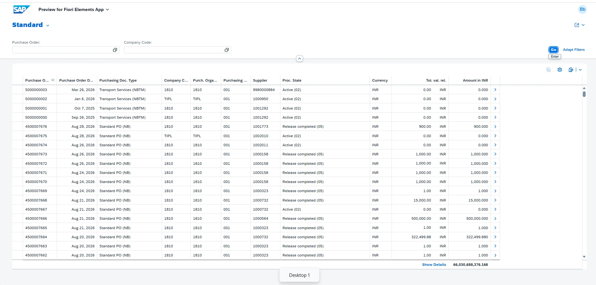
This sorts by purchase order in descending order by default.
Here's the result.
Step 9: Add Default Grouping
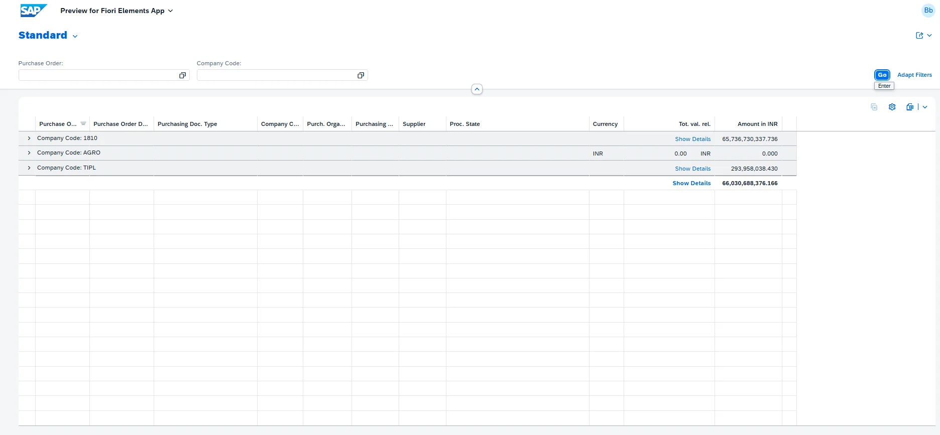
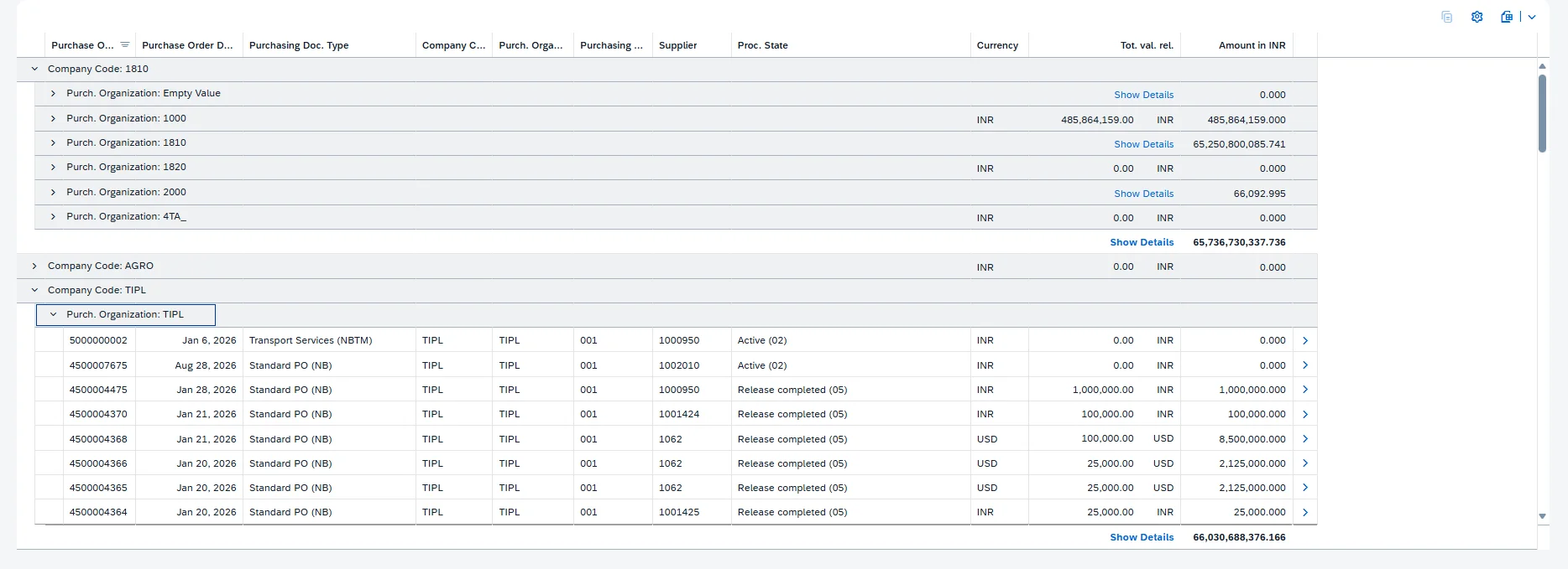
Clients often request default grouping as well, and multiple group-by fields can be configured.
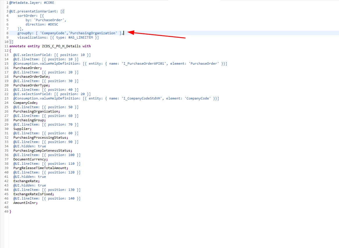
Here's what the grouped data looks like.
Step 10: Configure the Object Page
Next, let's look at the object page — the detail view shown when a user wants to see more information about a single entry.
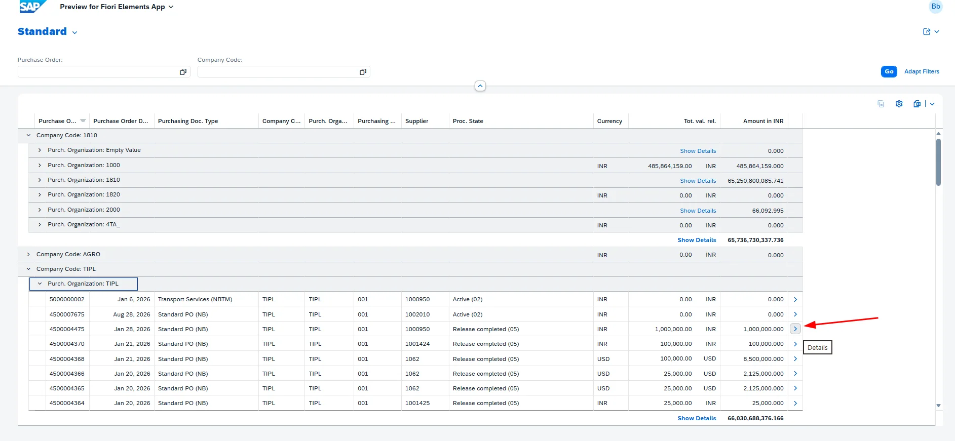
Here's the default object page.
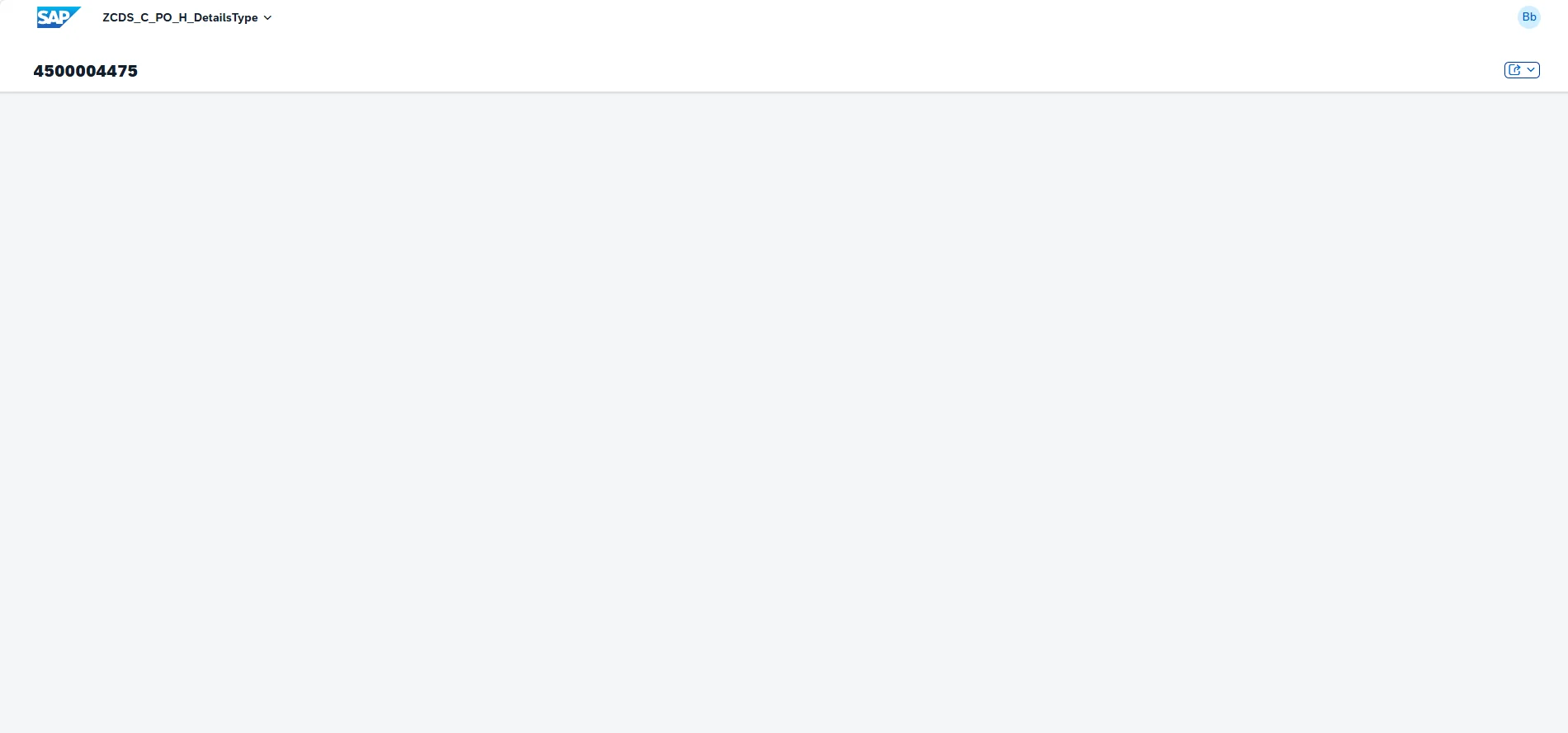
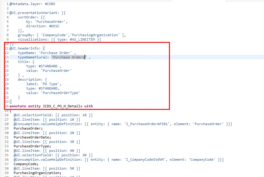
We'll format the header using the following annotation:
@UI.headerInfo: {
    typeName: 'Purchase Order',
    typeNamePlural: 'Purchase Orders',
    title: {
        type: #STANDARD,
        value: 'PurchaseOrder'
    },
    description: {
        label: 'PO Type',
        type: #STANDARD,
        value: 'PurchaseOrderType'
    }
}
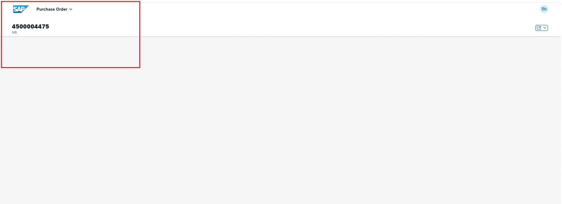
Here's the resulting header.
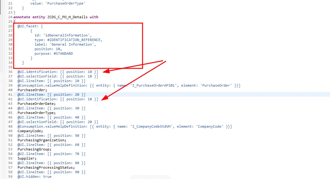
Now let's add a panel to display detail fields. This is done by adding a facet:
@UI.facet: [
    {
      id: 'idGeneralInformation',
      type: #IDENTIFICATION_REFERENCE,
      label: 'General Information',
      position: 10,
      purpose: #STANDARD
    }
]
And on each field, add @UI.identification: [{ position: 10 }].
This is sufficient if you only need a single panel.
To separate fields into different panels, define multiple facets:
@UI.facet: [
    {
      id: 'idGeneralInformation',
      type: #IDENTIFICATION_REFERENCE,
      label: 'General Information',
      position: 10,
      purpose: #STANDARD,
      targetQualifier: 'GeneralHeader'
    },
    {
      id: 'idAmountInformation',
      type: #IDENTIFICATION_REFERENCE,
      label: 'Amount Information',
      position: 20,
      purpose: #STANDARD,
      targetQualifier: 'AmountHeader'
    }
]
Then add the matching qualifier to each field, for example:
@UI.identification: [{ position: 10, qualifier: 'GeneralHeader' }]
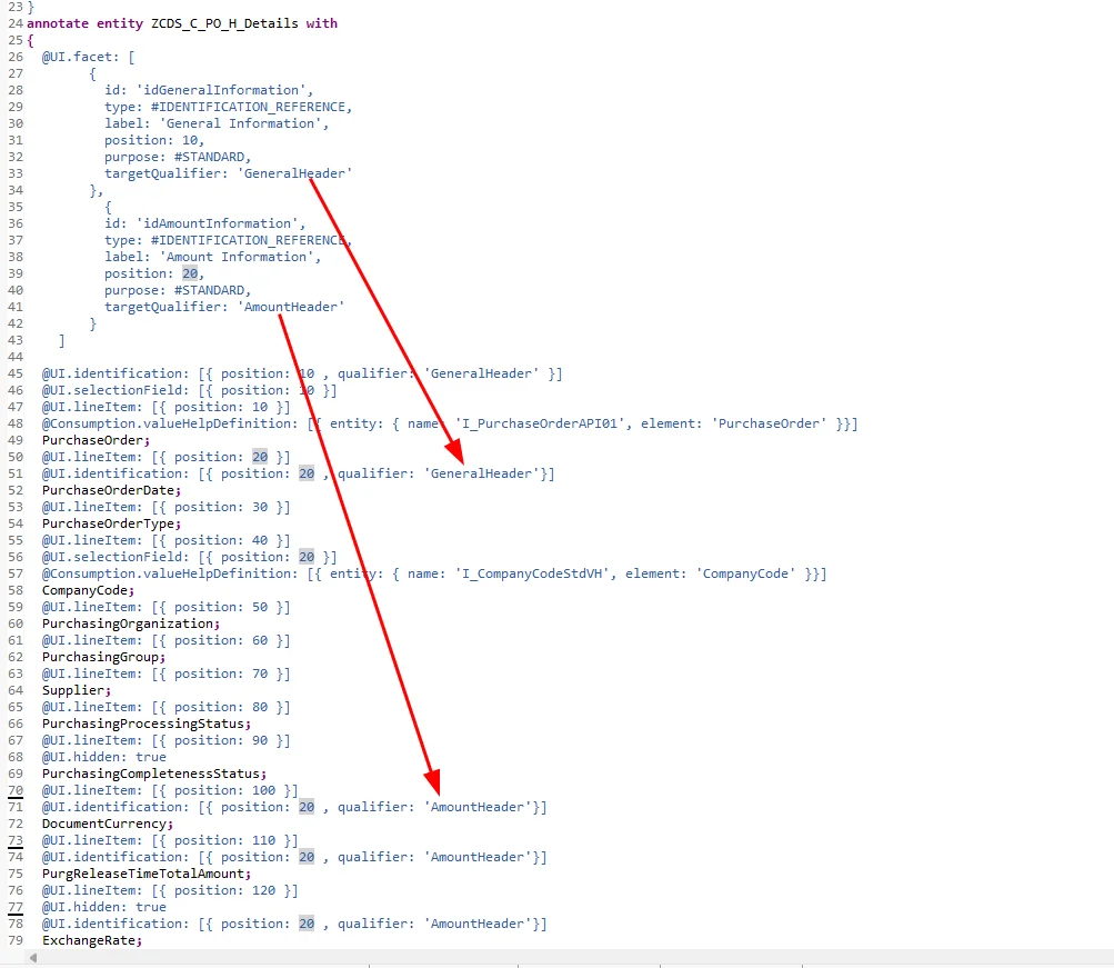
This produces separate panels for each category of information, making the object page easier to navigate.
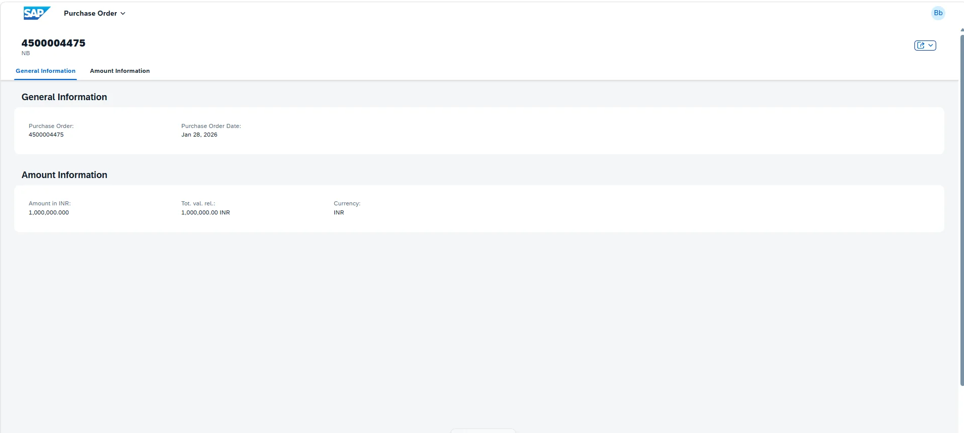
Wrapping Up
That covers the essentials of building an analytical RAP list report — from CDS views and value help to aggregation, sorting, grouping, and a well-structured object page. In the next part of this series, we'll add a table to the object page to display purchase order line items.